July 2, 20269 min read
How to Word a Sign Asking Guests to Upload Photos
Learn how to word a sign asking guests to upload photos with a simple four-part formula, a fill-in template, and a worked example you can copy today.
Most upload signs fail, and it is almost never because the idea is bad. Guests genuinely want to help. They have their phones in hand, they took the photos, and they would happily send them your way if only the sign told them how. The problem is the words. A sign either does too little, so a guest glances at it and has no idea what to actually do, or it does too much, cramming three sentences and a hashtag and a set of rules onto a card nobody reads at a party.
There is a simple formula that fixes both problems at once. Once you know the four parts a good upload sign needs, you can write one in your own voice in about two minutes, whether it goes on a big welcome easel or a tiny card by the cake. This guide teaches you that formula, gives you a fill-in-the-blank template, and then builds one real sign in front of you, step by step, so you can see exactly how the pieces come together.
The Four-Part Formula
Every sign that actually gets guests uploading does the same four jobs, in the same order. It catches attention, it tells people precisely what to do, it removes the small worry that stops them, and it gives them a reason to bother. Miss any one of these and the sign gets weaker. Here is the structure to build on:
- The hook. A short opener that catches the eye and warms people up, so the sign feels like an invitation and not an instruction manual.
- The clear instruction. One unmistakable action, usually "scan to share," with no jargon and nothing to puzzle over.
- The reassurance. A tiny line that removes the fear of a download or a login, because that fear is what stops most scans.
- The payoff. A few words on what happens next or why it matters, so uploading feels worth the ten seconds.
Keep them in that order and each part sets up the next. The hook earns the glance, the instruction spends it, the reassurance protects it, and the payoff rewards it. Everything below is simply how to write each part well.
Part 1: The Hook
The hook is the first thing a guest reads, and its only job is to make them keep reading. You have two easy ways to open. You can lead with warmth, speaking to the guest directly, or you can lead with a reason, telling them why this matters in a handful of words. Either works, and both beat a cold command, because a command tells people they have a task while an invitation tells them they get to help. Guests respond to the second far more readily than the first.
Keep it to one short line. Warm openers sound like "You saw moments we missed," or "Help us remember today," or the classic "Snap, share, celebrate." A reason-led opener might be "Our photographer cannot be everywhere," or "We want every angle of today." Notice that none of these have explained what to do yet. That is deliberate. The hook only opens the door. It should feel like the couple talking, not a sign shouting, so read it back and ask whether it sounds like something you would actually say.
Part 2: The Clear Instruction
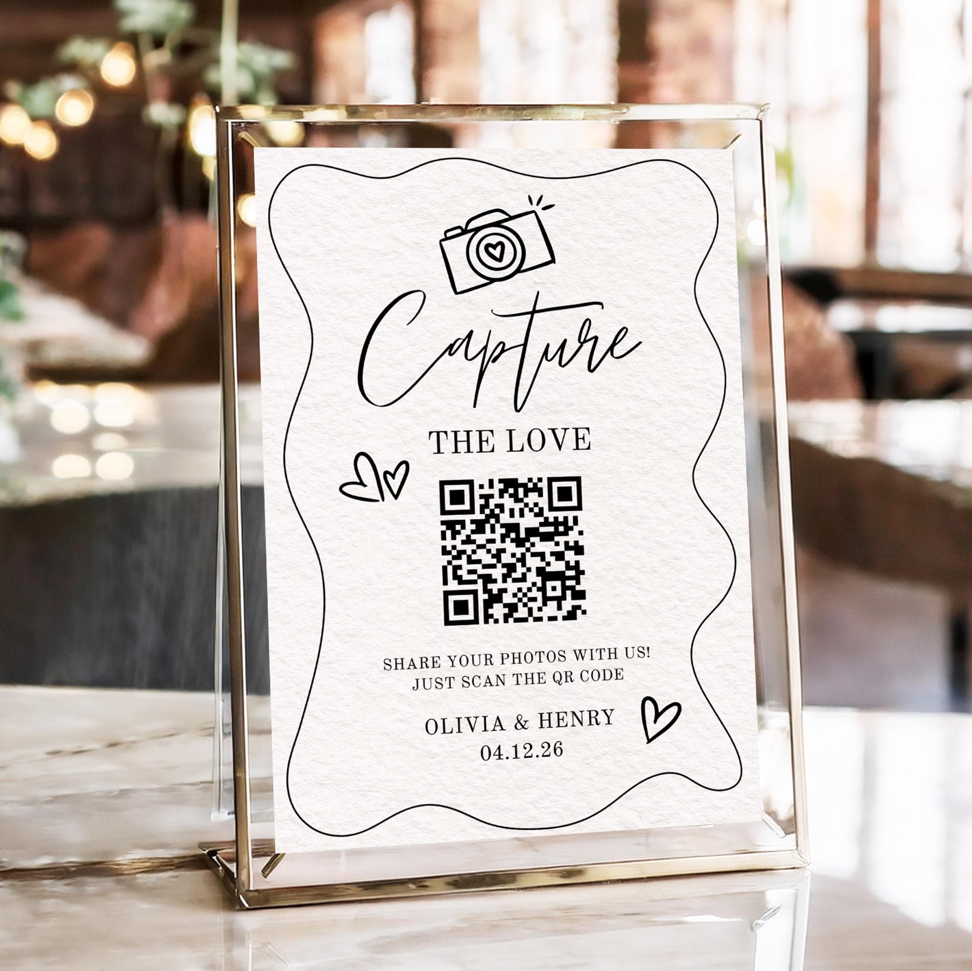
This is the part guests must not have to think about. Name a single action and name it plainly. For a photo sign, that action is almost always "scan the code," because a QR code turns a phone into an upload page in one tap. Write it as a verb the guest can do right now: "Scan the code to share your photos," or simply "Scan to add your pictures."
Cut anything that is not the action. No hashtags to remember, no email address to type, no account to create, no choice between three different ways to send things in. One instruction, one verb, one code. If you have not set the code up yet, our walkthrough on how to make a QR code for wedding photos covers where it should point and how to print it so it scans first time. The wording and the code are a pair, and the instruction is the line that connects them.
Part 3: The Reassurance
Here is the quiet reason a lot of guests hesitate. They imagine the scan will send them to an app store, or ask them to make an account, or want a password before they can do anything. That imagined friction is enough to make them decide to "do it later," and later never comes. One short line of reassurance removes the worry before it forms.
The line is small and it does an outsized amount of work: "No app, no sign-in," or "No download needed," or "Works right in your browser." That is it. You are simply promising that scanning leads straight to uploading and nothing else. This single addition is the one most people leave off, and it is often the difference between a guest who scans and a guest who means to. When your upload really is app-free and needs no login, say so plainly, because it is true and it is exactly what the hesitant guest needs to hear.
Part 4: The Payoff
The last part answers the small question in the back of a guest's mind: what is the point? Give them one. It can be a bit of magic, like "Watch them appear on the big screen," or it can be heartfelt, like "You will help us keep every moment of today." Either way it makes the ten-second effort feel worthwhile rather than like a chore someone set them.
Keep the payoff to a few words. It is the flourish at the end, not a paragraph. A live slideshow gives you an easy one, because guests love seeing their own shot pop up on the screen moments after they send it, and once one person spots theirs, the table beside them tends to start scanning too. If you are not running a slideshow, lean on the sentiment instead, reminding people that their angle of the day is one you will never get any other way. The point is only to leave the reader with a reason, so the sign ends on why rather than trailing off after the how.
Fill-in-the-Blank Template
Drop your own words into the four slots and you have a finished sign. The hook is your one warm or reason-led opener. The action is the single thing you want, almost always "share your photos from today." The reassurance is your "no app, no sign-in" promise. The payoff is the one reason that fits your day, whether that is the big screen or simply helping you remember it. Fill the slots in that order, say the whole thing out loud once, and trim any word that is not pulling its weight.
A Worked Example, Step by Step
Watching the sign grow one part at a time makes the formula click. Here it is, built line by line:
- Start with the hook. We open warm and personal: "You saw moments we missed." On its own it is inviting, but it does not tell anyone what to do yet.
- Add the instruction. Now we name the single action: "You saw moments we missed. Scan the code to share your photos." A guest now knows exactly what to do.
- Add the reassurance. We remove the hesitation: "You saw moments we missed. Scan the code to share your photos. No app, no sign-in." The worry about a download is gone before it starts.
- Add the payoff. We finish with a reason: "You saw moments we missed. Scan the code to share your photos. No app, no sign-in, and watch them appear on the big screen." That is the complete sign, four parts, in the guest's own moment.
Read that finished line back and notice how it flows. Nothing in it is clever or wordy, and that is the point. Each sentence does exactly one job, the whole thing reads in about five seconds, and a guest finishes it knowing what to do, that it is easy, and why it is worth doing.
Adjust the Length for the Sign
The formula flexes to fit the surface. A big welcome sign or an easel by the entrance has room to carry all four parts comfortably, so use the full version there where guests have a moment to stop and read. A small place card or a tiny table tent does not, and trying to fit everything on makes it unreadable. On the small stuff, keep the instruction, which is the one part that cannot be cut, and drop the rest.
- Big welcome sign or easel: use all four parts, the full hook, instruction, reassurance, and payoff, because there is space and time to read it.
- Table sign or menu card: keep the instruction plus one supporting part, usually the reassurance, so it stays short but still lands.
- Place card or tiny tent card: keep the instruction alone, such as "Scan to share your photos," and let the bigger signs carry the rest.
If you would rather start from lines that are already written, our collection of wedding photo sharing sign wording gives you ready-made examples to lift or tweak, and how to ask wedding guests to share their photos covers the wider strategy around timing and placement so your signs land at the right moments.
Test It Before You Print
- Read it out loud. If it sounds stiff or takes more than one breath, cut words until it sounds like you talking.
- Check that it scans. Point your own phone at the code from where a guest would stand, and confirm it opens the upload page fast.
- Confirm one instruction only. If the sign asks for two things, remove one, because a second ask splits attention and lowers follow-through.
- Make sure the code is big enough. A crisp, generously sized code beats a tiny one every time, especially on signs people read from a step or two away.
That is the whole method. Learn the four parts, drop your words into the template, and adjust the length to the sign in front of you. Do that and you are not copying someone else's line, you are writing your own in your own voice, and it will do the one thing an upload sign is for: turn a guest with a phone full of photos into a guest who actually sends them to you. The best part is that you only have to word it well once, and then every sign around your day, from the welcome board to the last table card, quietly does the collecting for you while you enjoy the day itself.
Frequently asked questions
How do I word a sign asking guests to upload photos?
Use a simple four-part formula: a hook to catch attention, one clear instruction such as "scan to share," a short reassurance like "no app, no sign-in," and a payoff that gives a reason. Write each part in your own voice, keep it short, and read it out loud before you print it.
What should a wedding photo upload sign say?
At minimum it should tell guests exactly what to do, usually "Scan the code to share your photos." A great sign also warms them up with a friendly opener, reassures them there is no app or login, and ends with a reason to bother, such as seeing their shots on a live slideshow.
Should the sign say no app needed?
Yes. The fear of an app download or account is the quiet reason many guests never scan. A short line like "No app, no sign-in" removes that worry and noticeably lifts follow-through. When your upload really is app-free and works in the browser, say so plainly.
How long should a photo-sharing sign be?
As long as the surface allows and no longer. A big welcome sign can carry all four parts, while a place card should keep only the instruction. The whole sign should read in about five seconds, so trim any word that is not doing a job.
What is a good call to action for a photo sign?
Keep it to a single verb the guest can do right now, like "Scan to share your photos from today." Avoid offering two options or extra steps. Pair the words with a clear, generously sized QR code so the action and the code work as one.
Word it once, collect forever
Write your line, add a QR code guests scan to upload in seconds with no app, and every photo lands in one gallery. Create your event in minutes.